NO.PZ2021061603000017
问题如下:
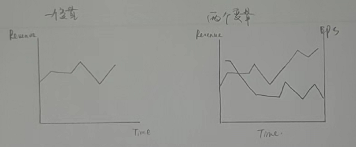
A line chart with two variables-for example, revenues and earnings per share-is best suited for visualizing:
选项:
A.the joint variation in the variables. B.underlying trends in the variables over time. C.the degree of correlation between the variables.解释:
B is correct. An important benefit of a line chart is that it facilitates showing changes in the data and underlying trends in a clear and concise way. Often a line chart is used to display the changes in data series over time. A is incorrect because a scatter plot, not a line chart, is used to visualize the joint variation in two numerical variables. C is incorrect because a heat map, not a line chart, is used to visualize the values of joint frequencies among categorical variables.
这里面哪有时间的事啊,为什么不选C,两个变量一个横轴一个纵轴,就是看二者的关系吧


